
About The Brand
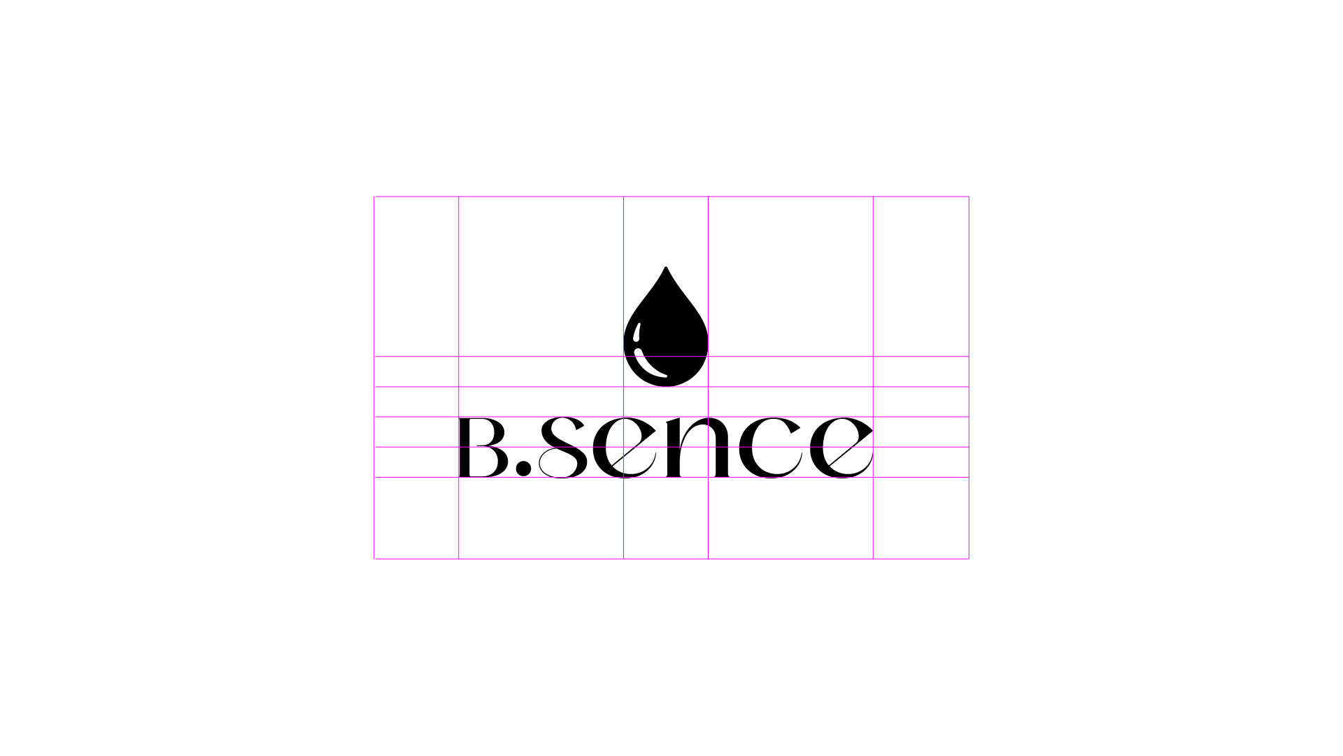
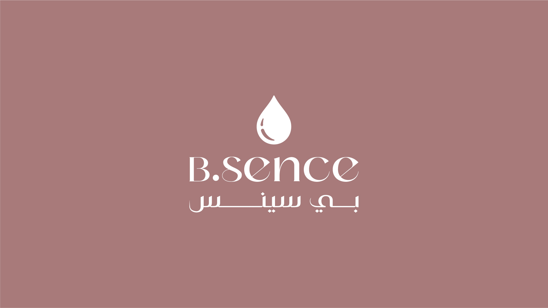
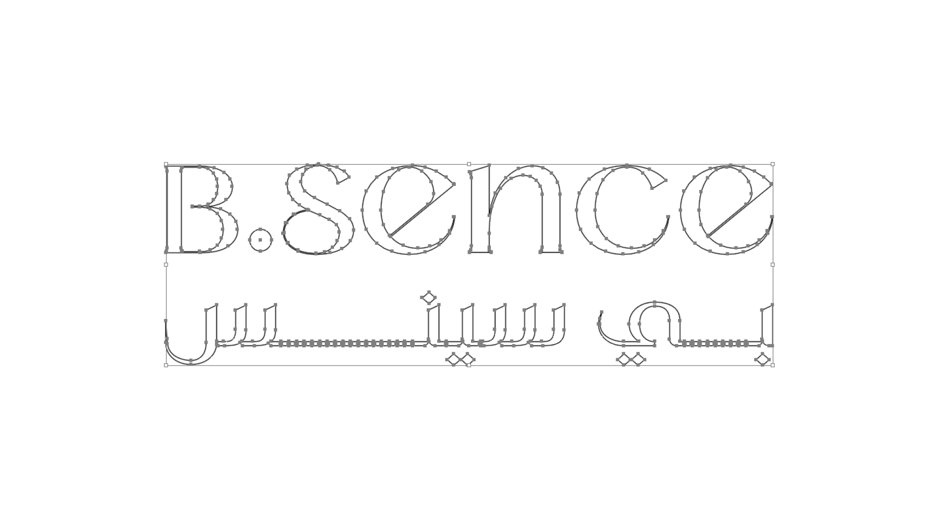
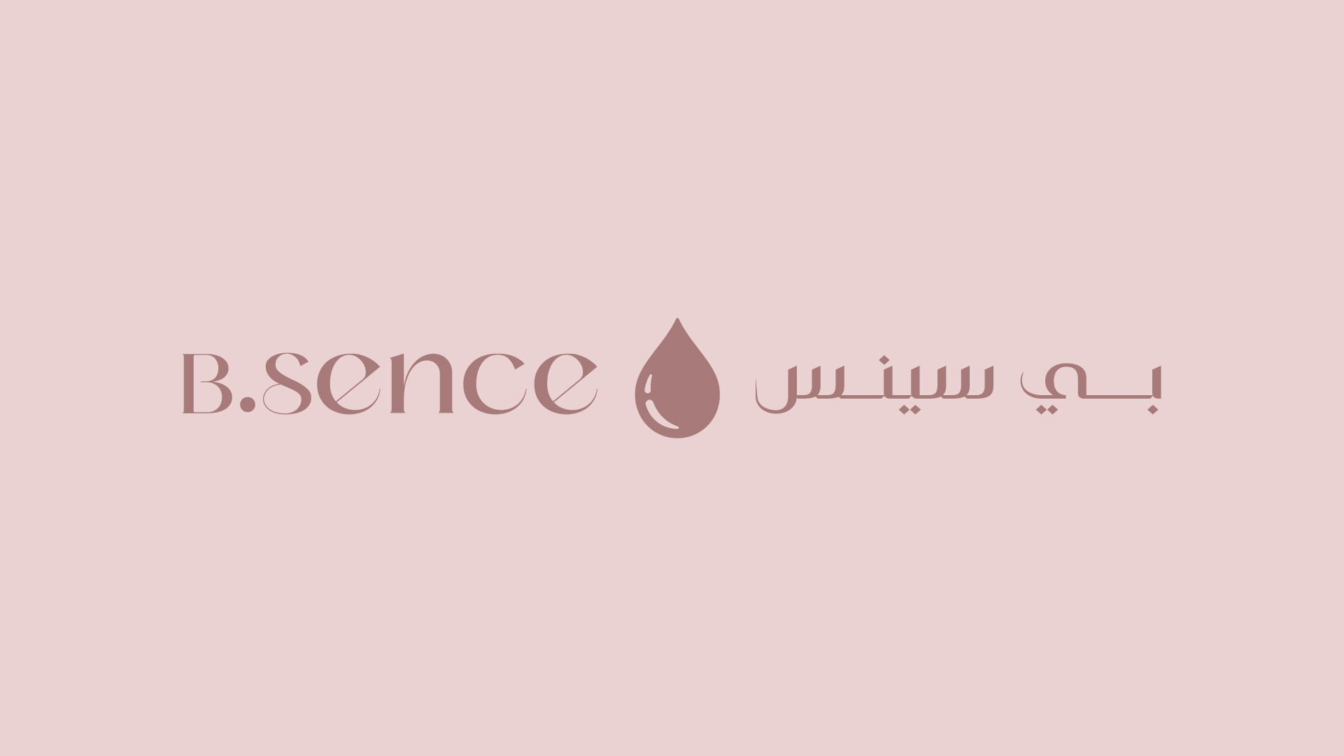
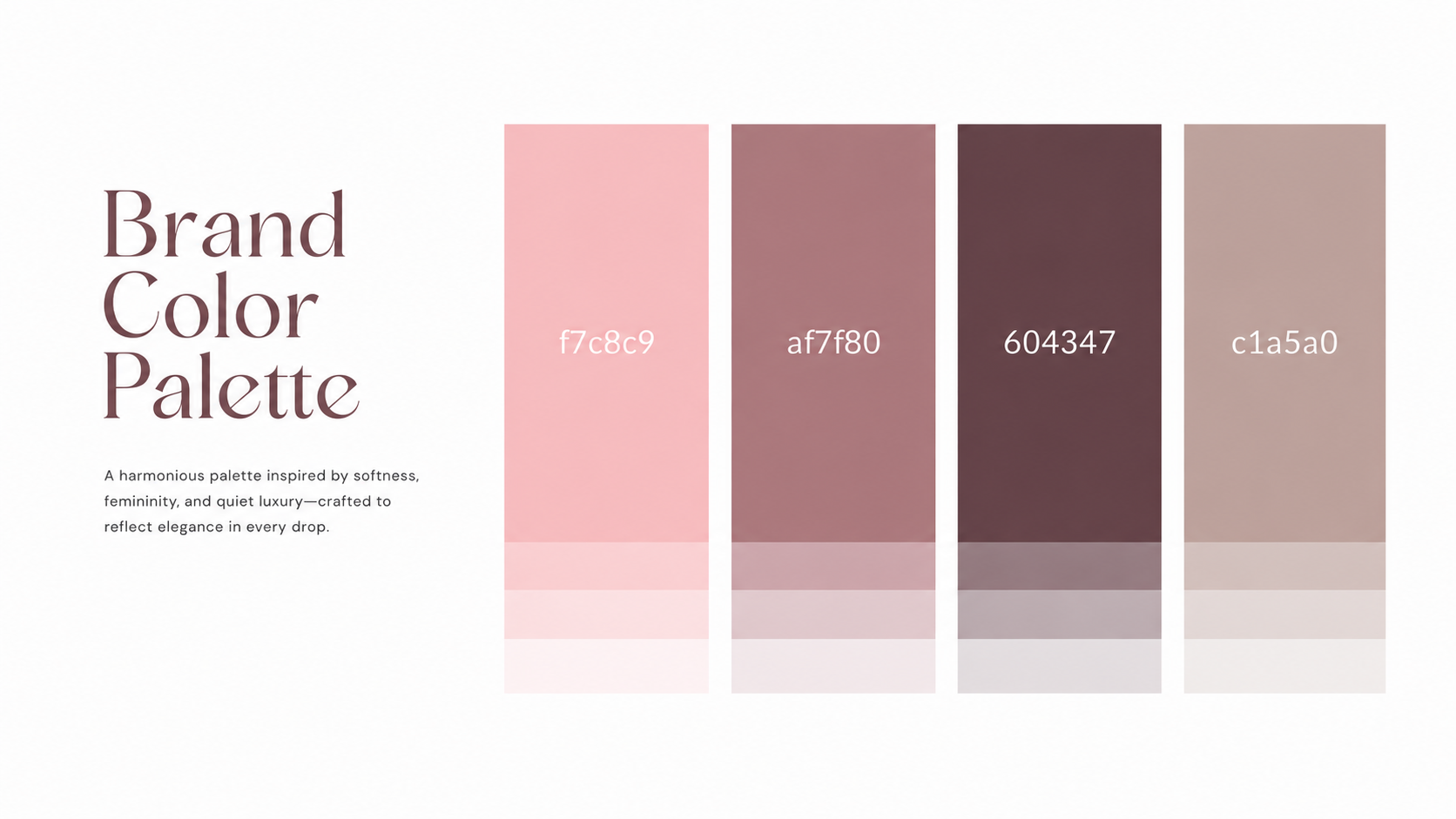
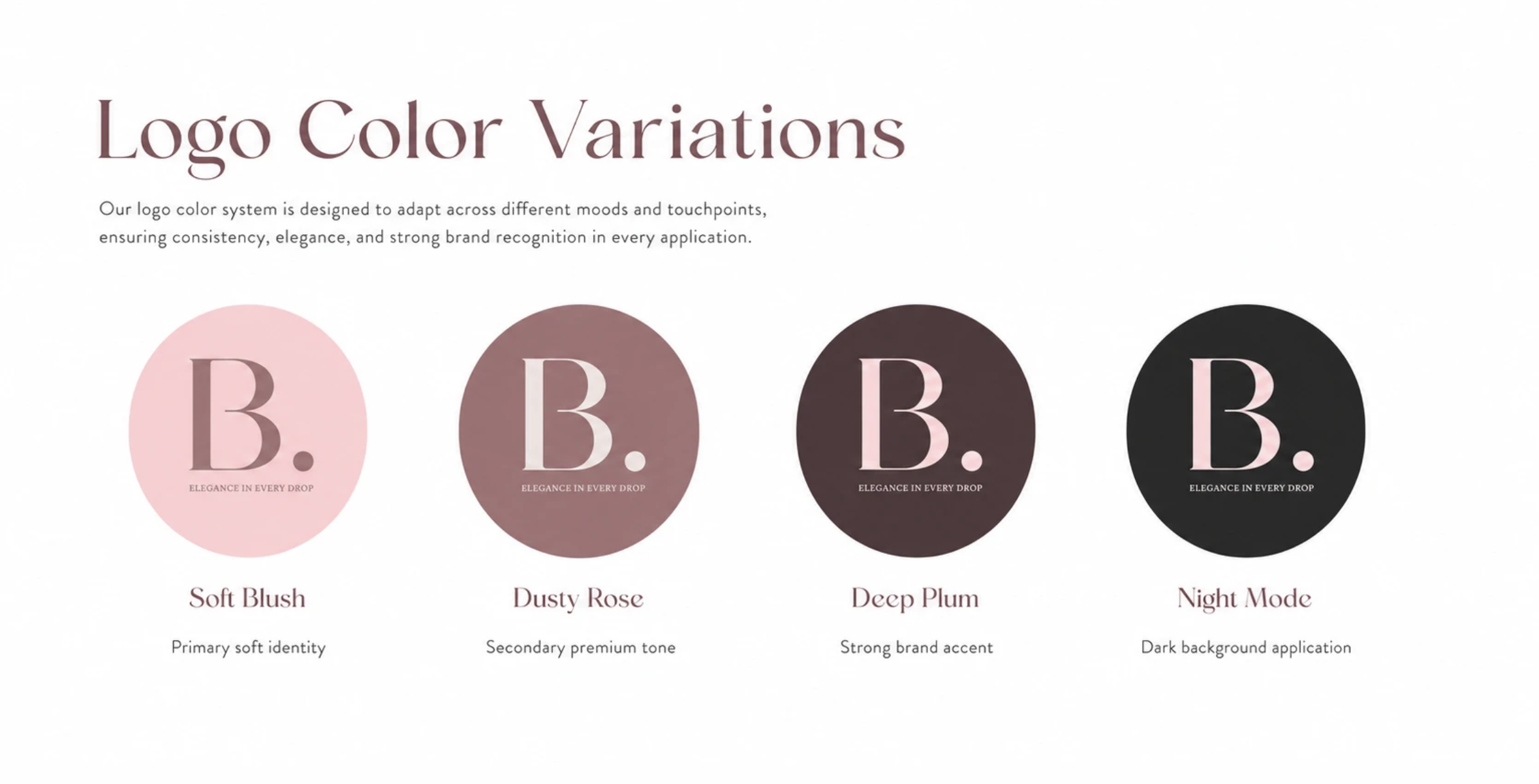
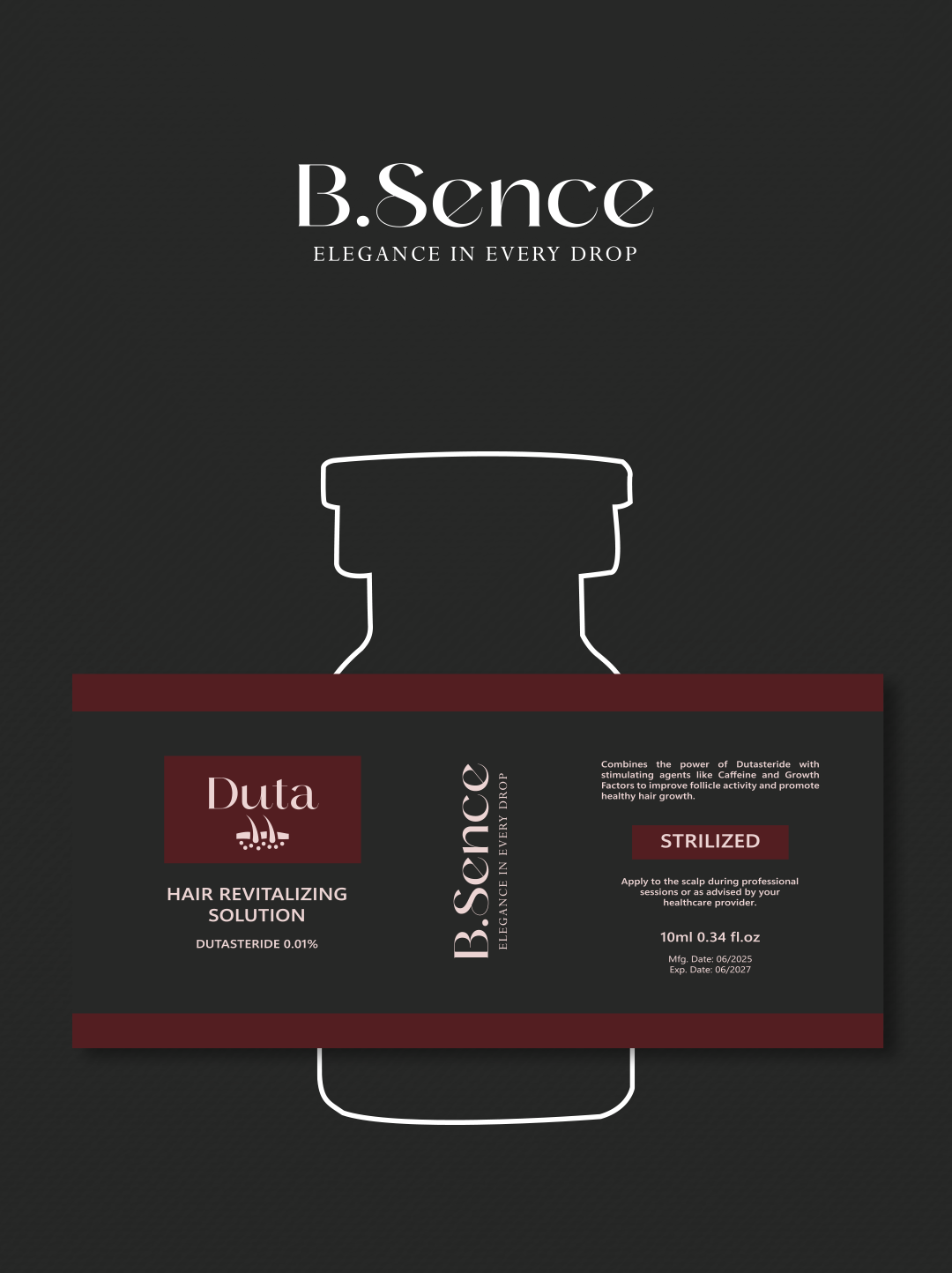
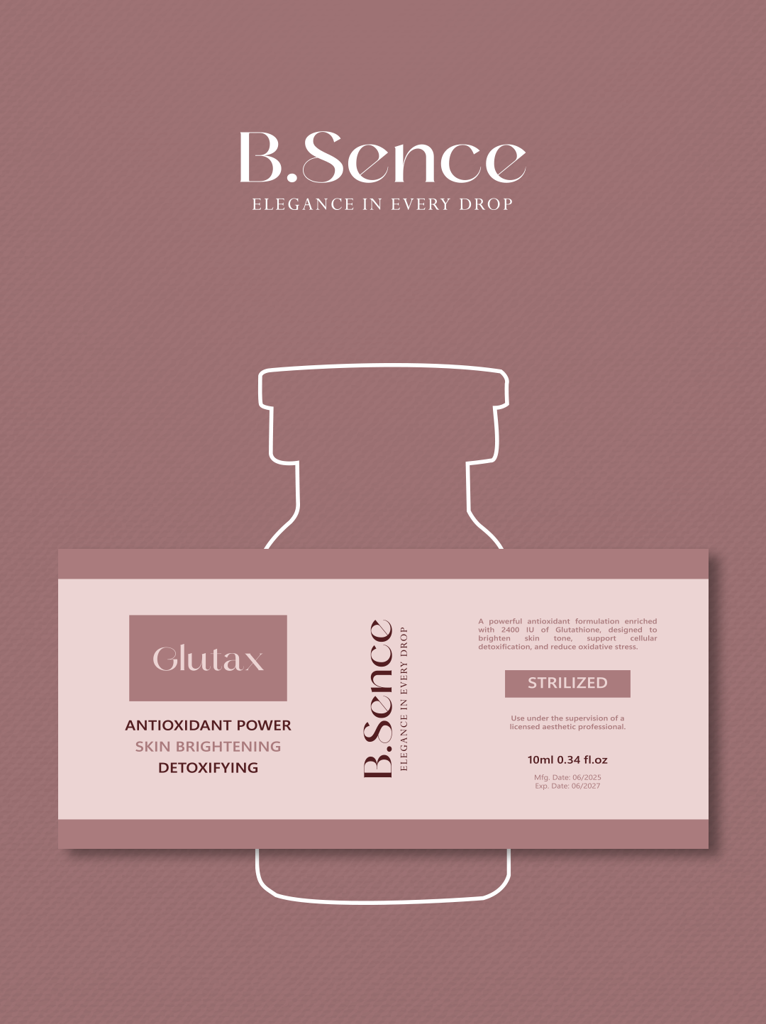
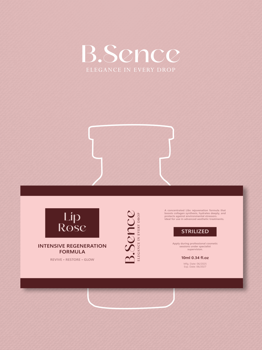
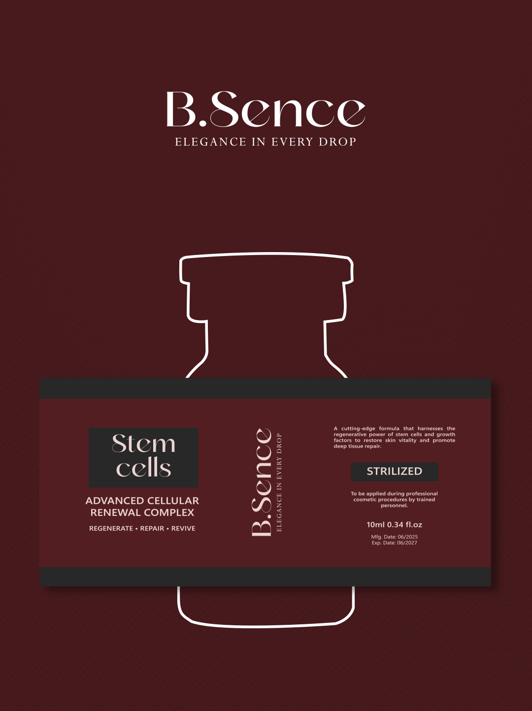
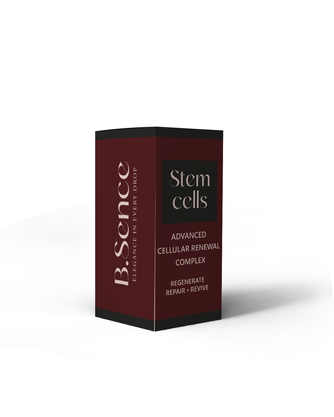
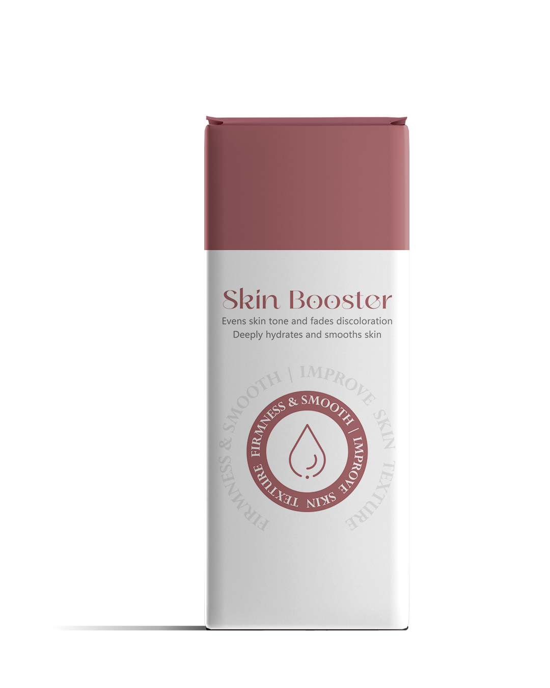
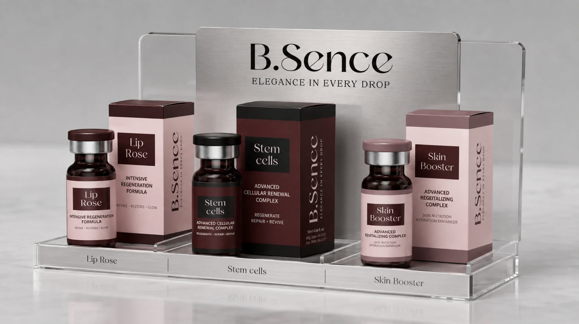
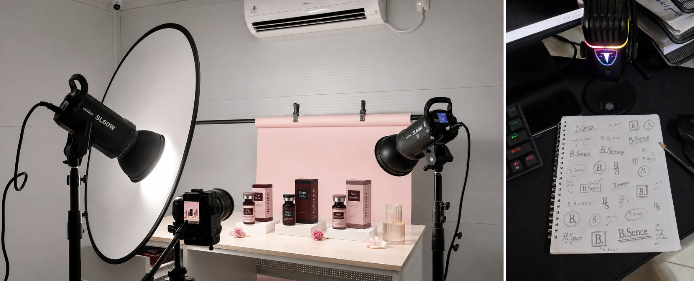
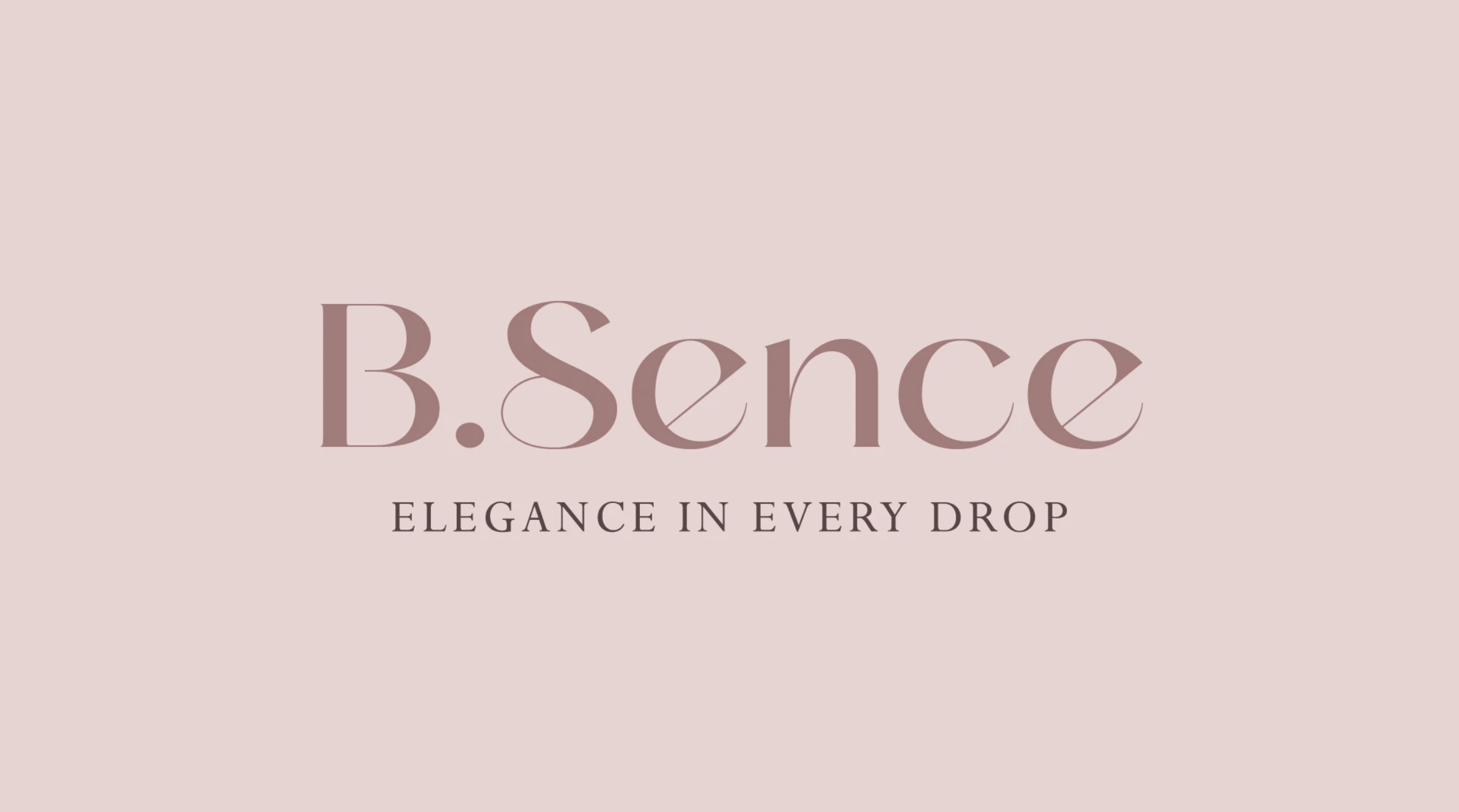
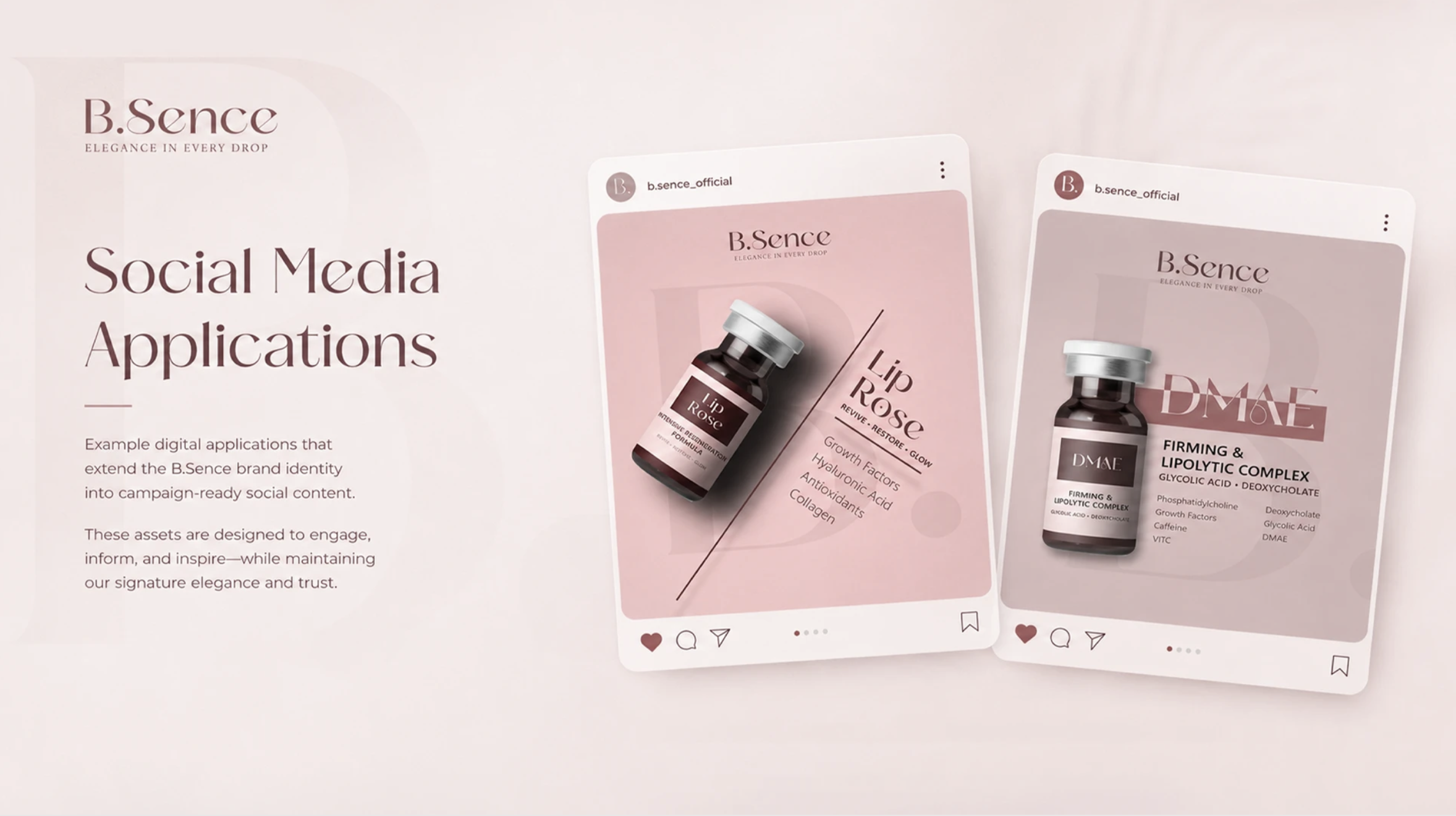
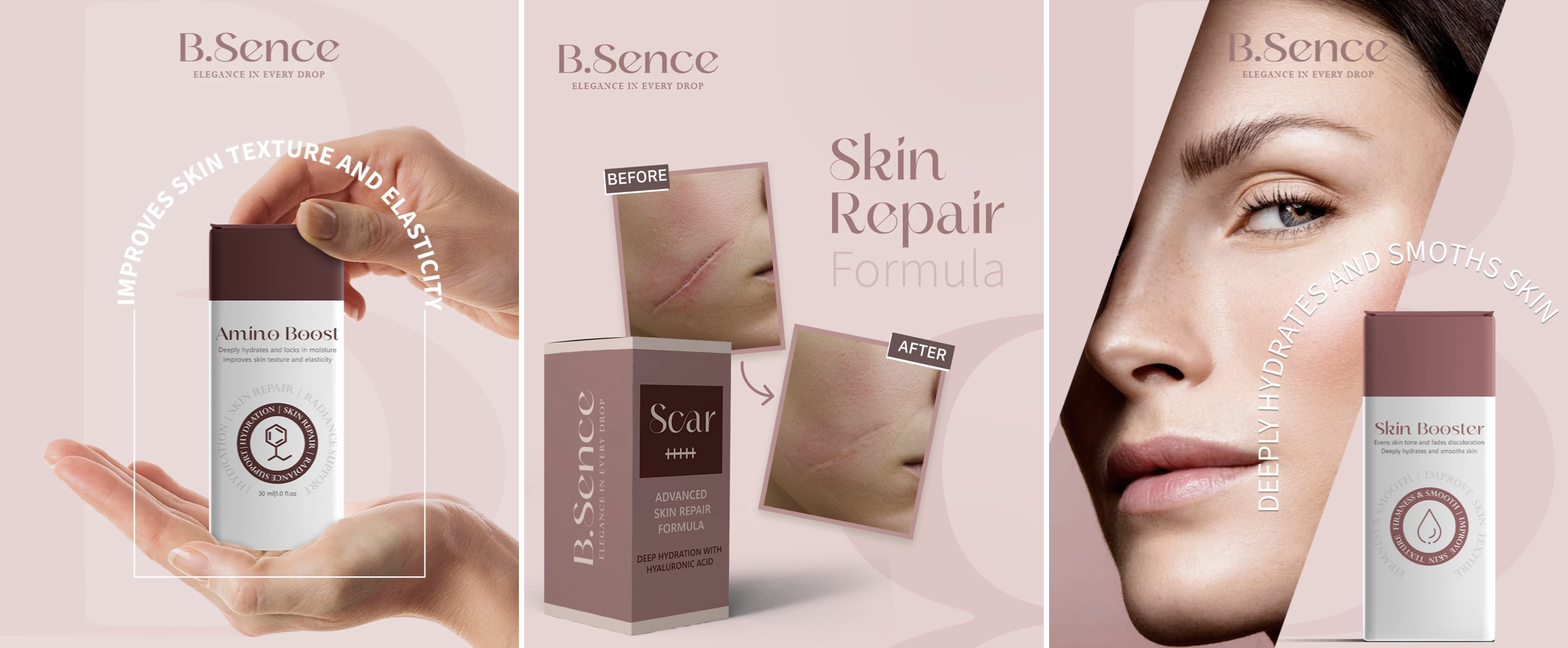
The B.Sence logo embodies the concept of quiet luxury, balancing strong letterforms with delicate curves to reflect a harmonious relationship between performance and softness. The fluidity of the typography is inspired by the movement of droplets and the smooth textures of skincare formulations, while the dot symbolizes precision and concentration within every formula. The powder-pink and muted mauve tones complete this philosophy, giving the brand a warm, feminine, and sophisticated presence. It is a visual identity that expresses elegance felt in every detail and in every drop.
Year → 2026
Client → B.Sence
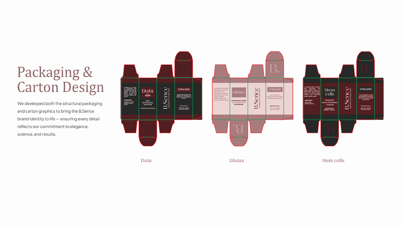
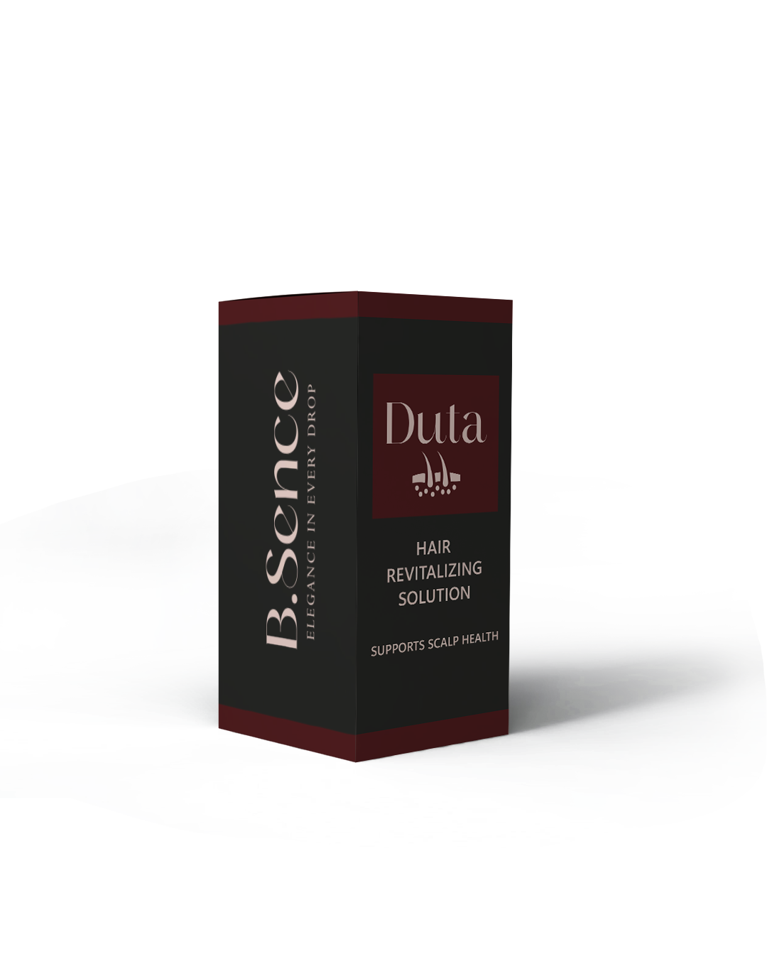
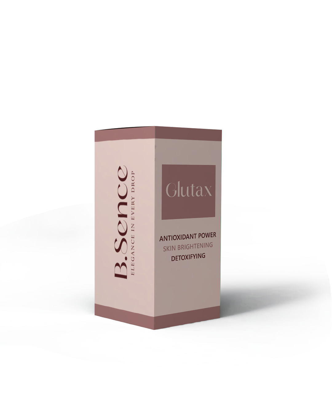
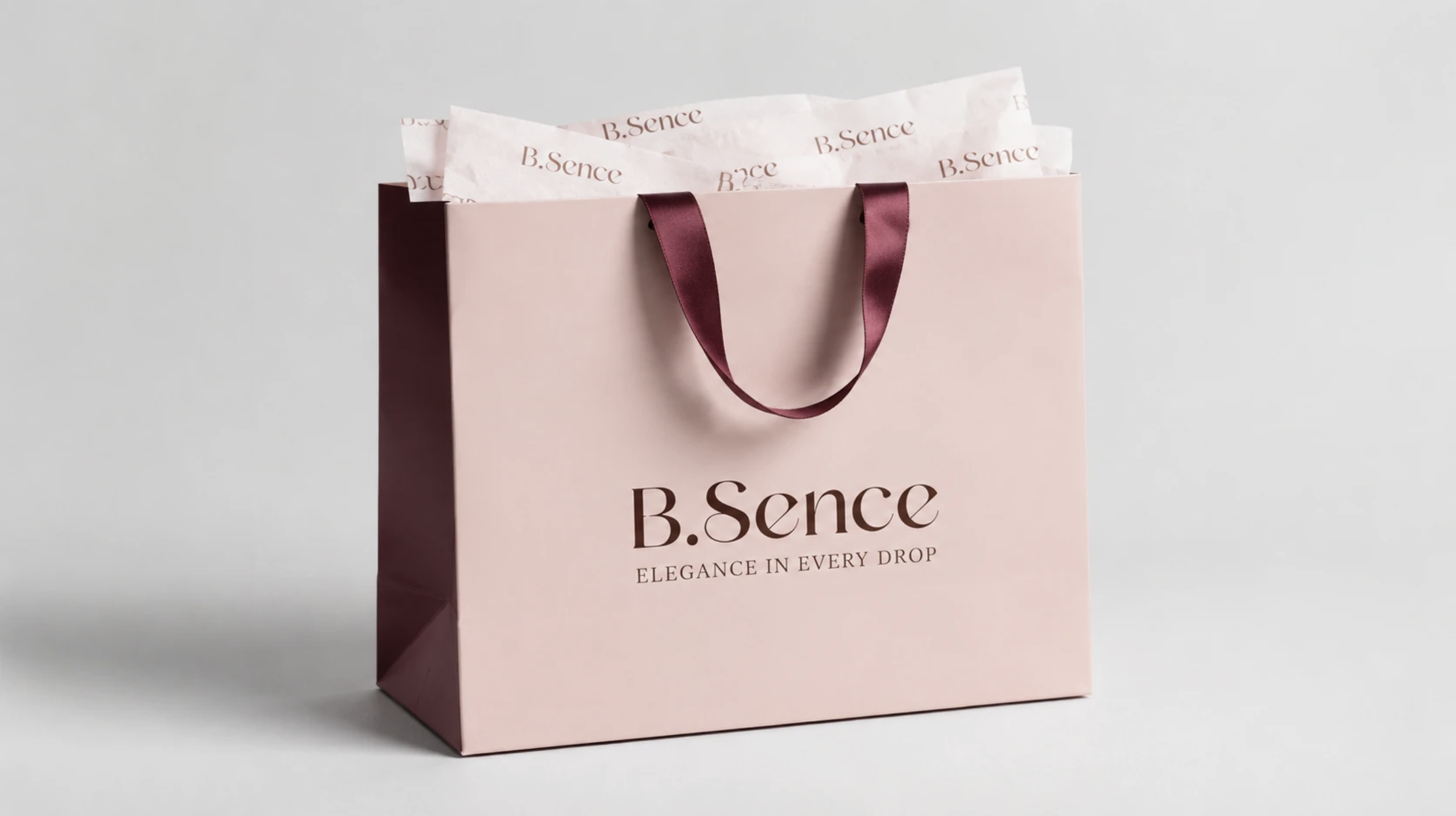
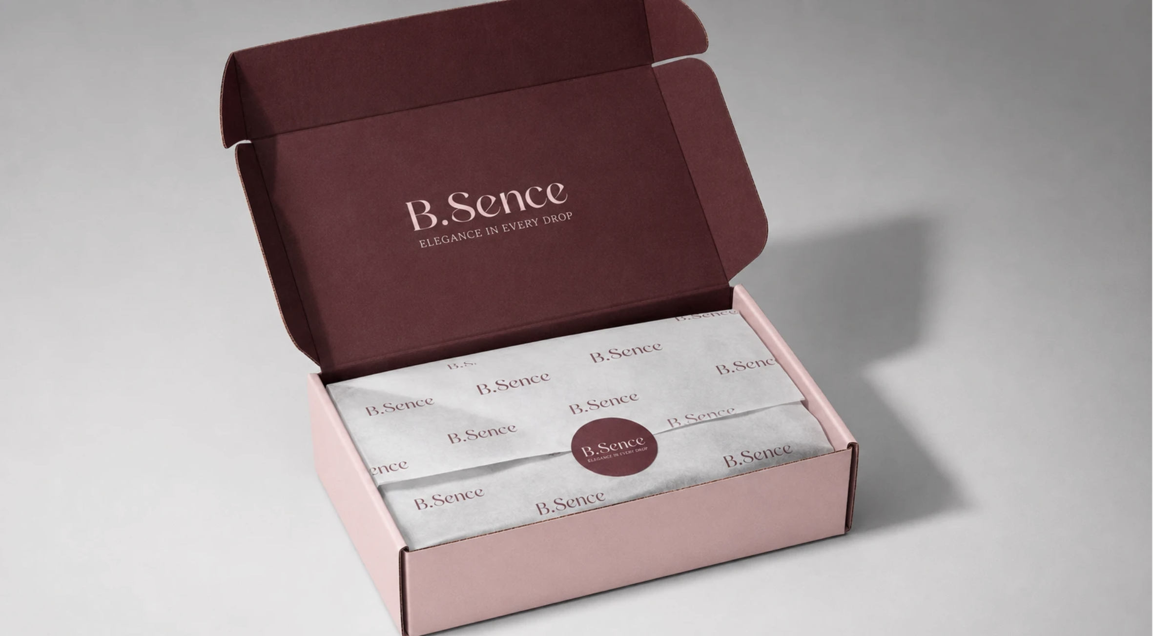
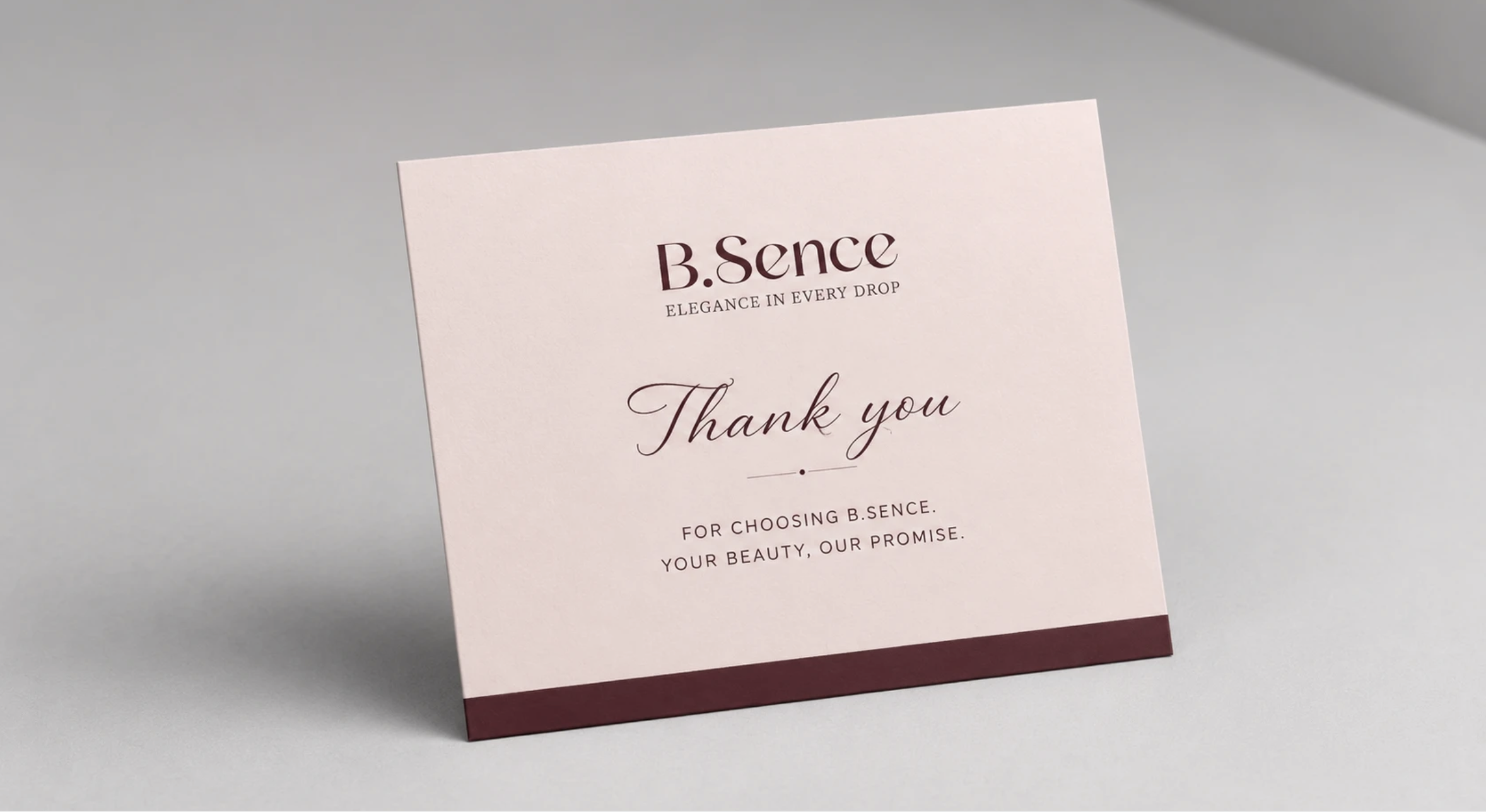
Project → Logo , Labels, Packaging & Brand Identity
All rights reserved ©